Context
A complete redesign of the Axis product necessitated an entirely new design system to be built from the ground up. This also provided an opportunity for a ‘source of truth’ reference point for Axis product assets, fundamental behaviours and stylistic consistency.
Solution
This involved establishing fundamental UX & UI principles, defining UI behaviours, collating a library of product assets and documenting the finer design details to ensure effective communication and implementation of design vision.
Impact
Building the design system helped to bring clarity to the Axis product from typical use cases to edge cases. More so, it created a centralised location for design reference when creating new product features, ultimately enabling a smoother, more streamlined product build.
A small snippet of a much larger system
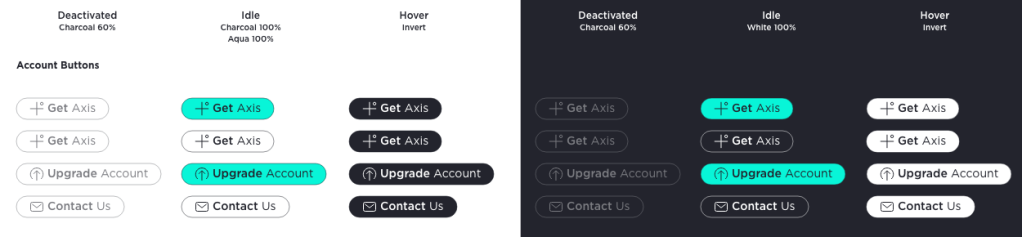
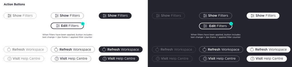
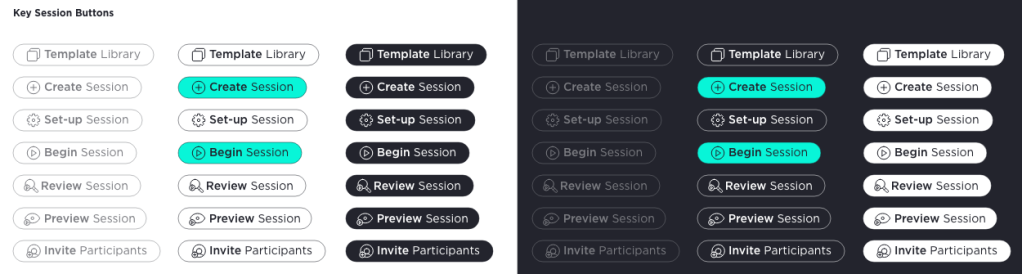
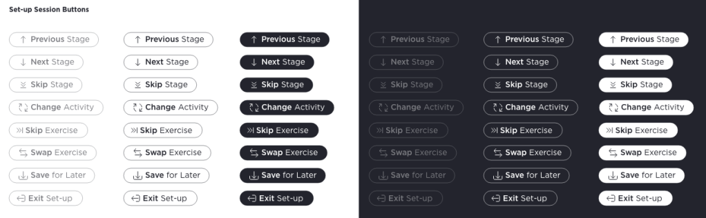
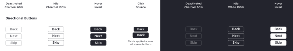
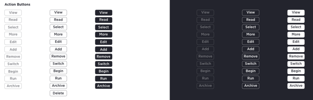
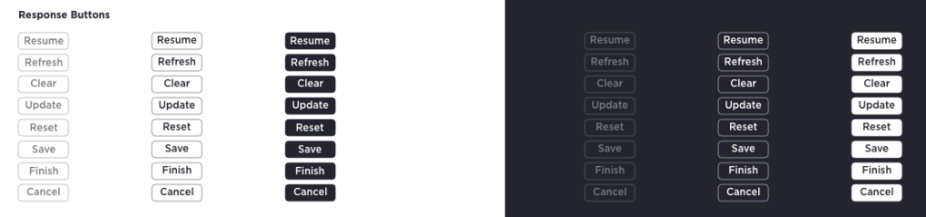
Axis Buttons
Axis general purpose buttons were segmented into a three tier hierarchy: pill, square and text. This was primarily to separate importance of function and communicate this to the user.
Behaviours
intended for major user interactions & transitions
intended for functional user interactions; not for screen transitions
intended primarily for hyperlinks to external resources and low importance functions
Button Padding & Sizes
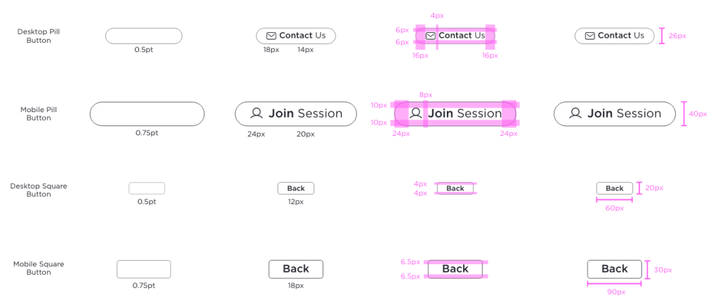
Button Library
Axis Communication Principles
For Axis, communication relates to any method in which product information is relayed to the user. This can take many forms and can be executed differently through the UI. Communication is a vital part of the UX and should be coherent throughout the Axis product.
Types of communication
Confirmation & Acknowledgment
Confirming and acknowledging user actions reduces uncertainty about an action that a user has taken or is about to take. This also prevents users from making mistakes.
Errors
Errors keep the user informed about the result of an action in the case of an unexpected result and prevent the user flow from resulting in a dead end.
Passive
Passive communication is subtle and includes the micro feedbacks the user receives from their interactions with the product that enhance their experience.
Empty States
Empty States are necessary in the case of the absence of data. They are important communications so that the user does not become lost/confused in the user flow.
Background Tasks
Tasks such as loading or saving need not distract from the current user action but are important passive confirmations which help the user feel more secure.
Onboarding
Communication should have specific goals related to the user’s level of familiarity with the product. Onboarding is unique in its informative and potentially one-off nature.
Methods of communication
Tooltips
Used for drawing user attention to specific feature or screen area; ideal for onboarding and highlighting components in error state with further context.

Toasts
Used for medium level confirmation/acknowledgment messages and errors. This allows the user to be notified of these communications without distracting them significantly from the current user journey.

Modals
Used for high level confirmation/acknowledgment messages and errors. Needed where a user case requires user interaction to dismiss modal and thereby acknowledge the communication

Progress Indicators
Components that give context to a larger journey or a passive single instance communication such as loading/saving animation.

Component States
Subtle communication of button function and indication of possible or successful interaction with component.

Empty States
Visual assets used to communicated an absence of data.

 DBK
DBK 